Simplifying the user flow to add shared expenses & adding new category features to increase the conversation rate to Pro

About the app

Splitwise helps people keep track of their shared expenses with flatmates, friends, and family. The app organises shared expenses so that everyone can see who paid what and how much they owe to each other. For example, sharing a vacation, splitting rent, or paying someone for lunch.
During Memorisely's UX/UI bootcamp, I worked with my team partner Nicola to improve the user flow to add shared expenses and the group overview UI, and we also added category features to increase the conversion rate to Pro.
Business goal
In order to proceed with this case study, we have set the business goal of Splitwise to increase the conversation rate to their paid product. This is important because we wouldn't know which direction all the improvements should contribute towards otherwise.
Research
Survey
In order to identify problem spaces, we have conducted a survey and distributed it to people who have used Splitwise before.
Since we couldn't not gather enough data through the survey, we also went through the app reviews and used them as a voice of users.

Synthesising
After gathering the input from users, we have synthesised all the data in order to find problematic points in apps that user finds frustrating to use.

Problem
After conducting research, we have identified a number of issues that users have encountered. We have focused on addressing the most significant problems among the many.

Minimum categories
Users felt categorisation lacks some useful features
Unclear tracking
Users found tracking all the shared expenses challenging

No interest in Pro
Many of the users weren't interested in Pro features
Benchmarking
As part of our research, we selected a direct competitor and an indirect competitor of Splitwise and conducted a benchmarking analysis.
For a direct competitor, we selected Tricount, which I've experienced previously.

For a indeirect one, we selected an app from the bank apps that Nicola has used before.

With this analysis, we identified Splitwise's strengths and possible areas for improvement by comparing it to its competitors. This information was beneficial to us during the ideation phase.
Information Architecture
We've also created the Information Architecture of the latest version of Splitwise. We thoroughly examined the app, familiarizing ourselves with its structure and the location of its data.

During this exercise, we noticed that the same information was displayed on multiple screens unnecessarily. We got the impression that the app seemed to be designed more from a database perspective rather than considering the needs of its users.
Ideation
Following our research, we brainstormed ways to tackles the issues we uncovered and encourage users to try the pro feature. To achieve this, we utilized two techniques: mind mapping and Crazy 8.


After the ideation, we have decided to focus on the following ideas to tackle the four problem areas identified in our research.
→


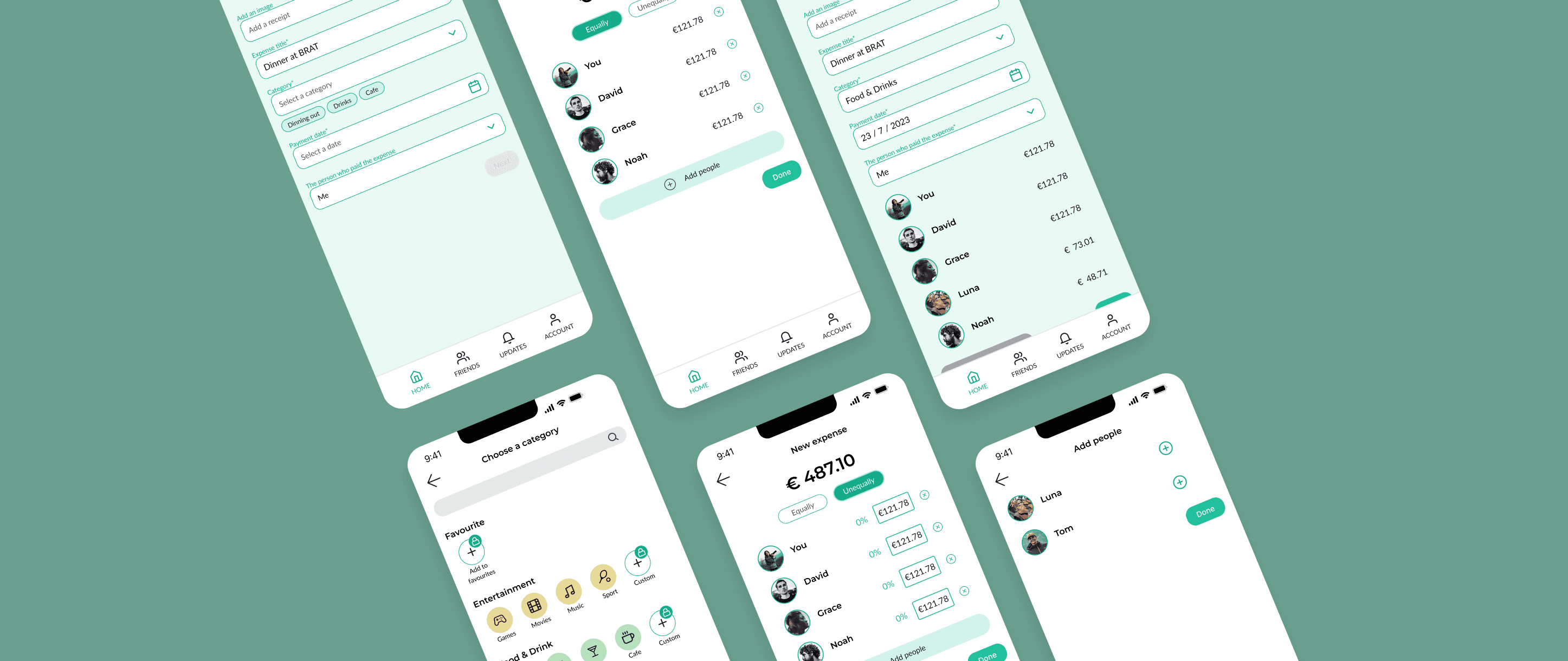
Simplify the steps users need to go through when adding an expense
Improve the interface with clearer design so that users know what to do

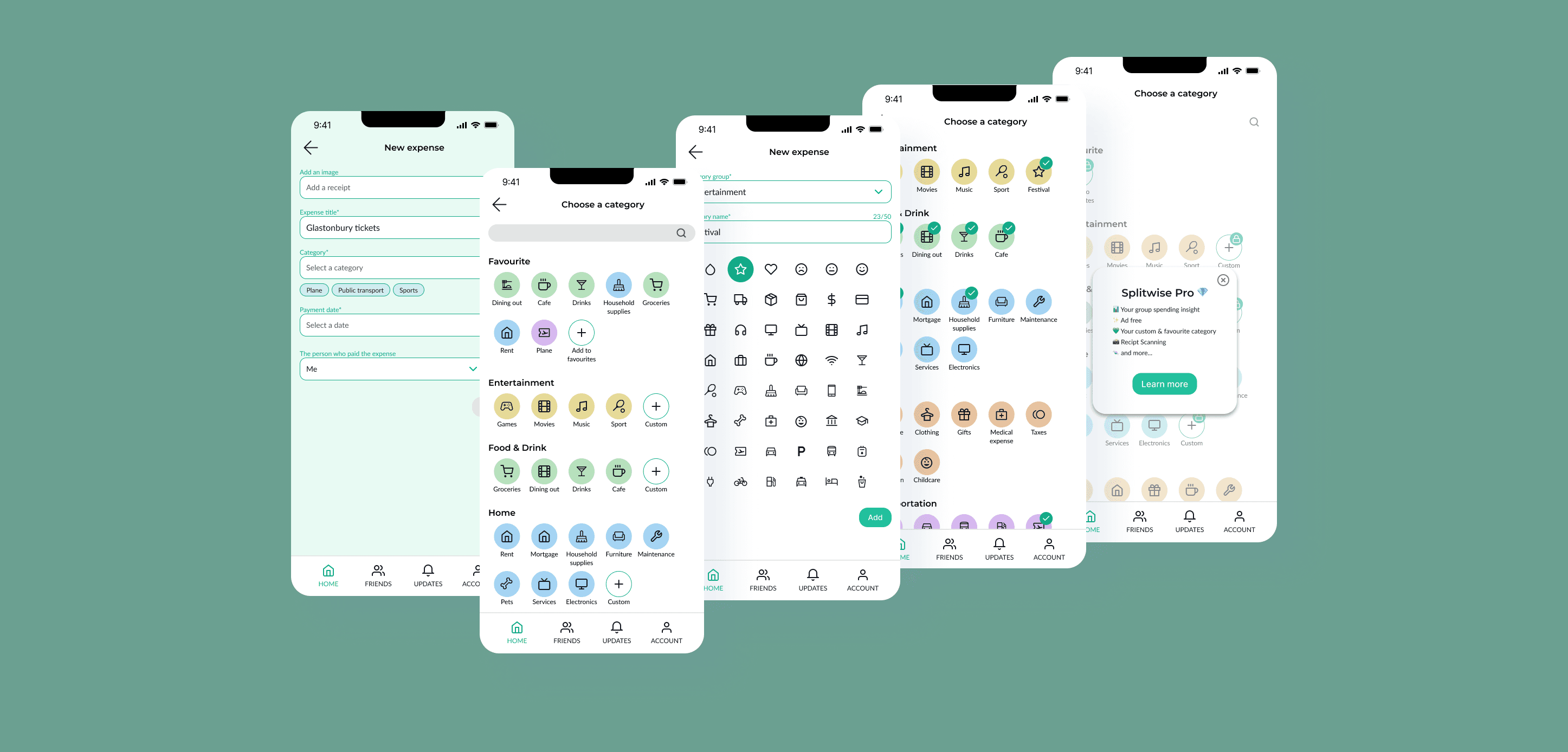
Improve the interface design for the category page
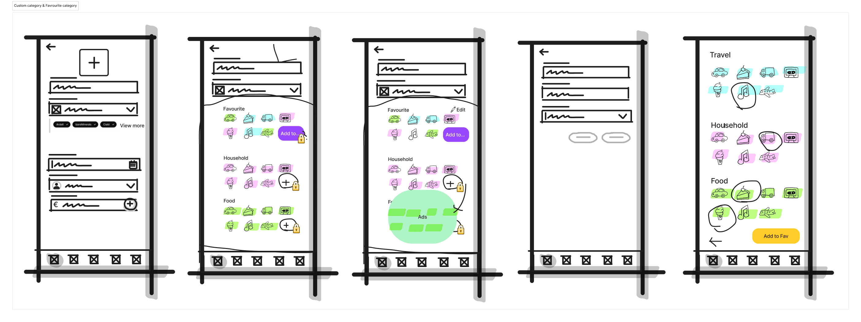
Custom category
Favourite category
→

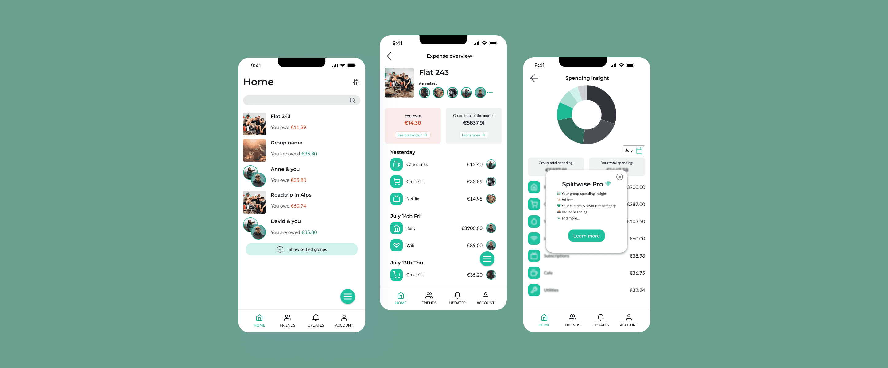
Get rid of unnecessary features
Improve the interface with clearer design so that users can easily see who paid what
→

A blurred sneak peak of spending insight feature from Pro
Making custom category and favourite category as Pro features
Design
User flow
Prior to beginning low-fidelity wireframing, we outlined the current user flow in the Splitwise, then proceeded to outline the enhanced user flow.
The original flow

After outlining the process, we noticed that splitting expenses unequally requires many steps, making the process quite complex.
The improved user flow

Low fidelity wireframing
Based on the improved user flow I outlined, I created the wireframes.
Simplified flow
Simplify the steps users need to go through when adding an expense


Enhanced category experience
Show what they could do
Improve the interface design for the category page
Custom category
Favourite category
Making custom category and favourite category as Pro features
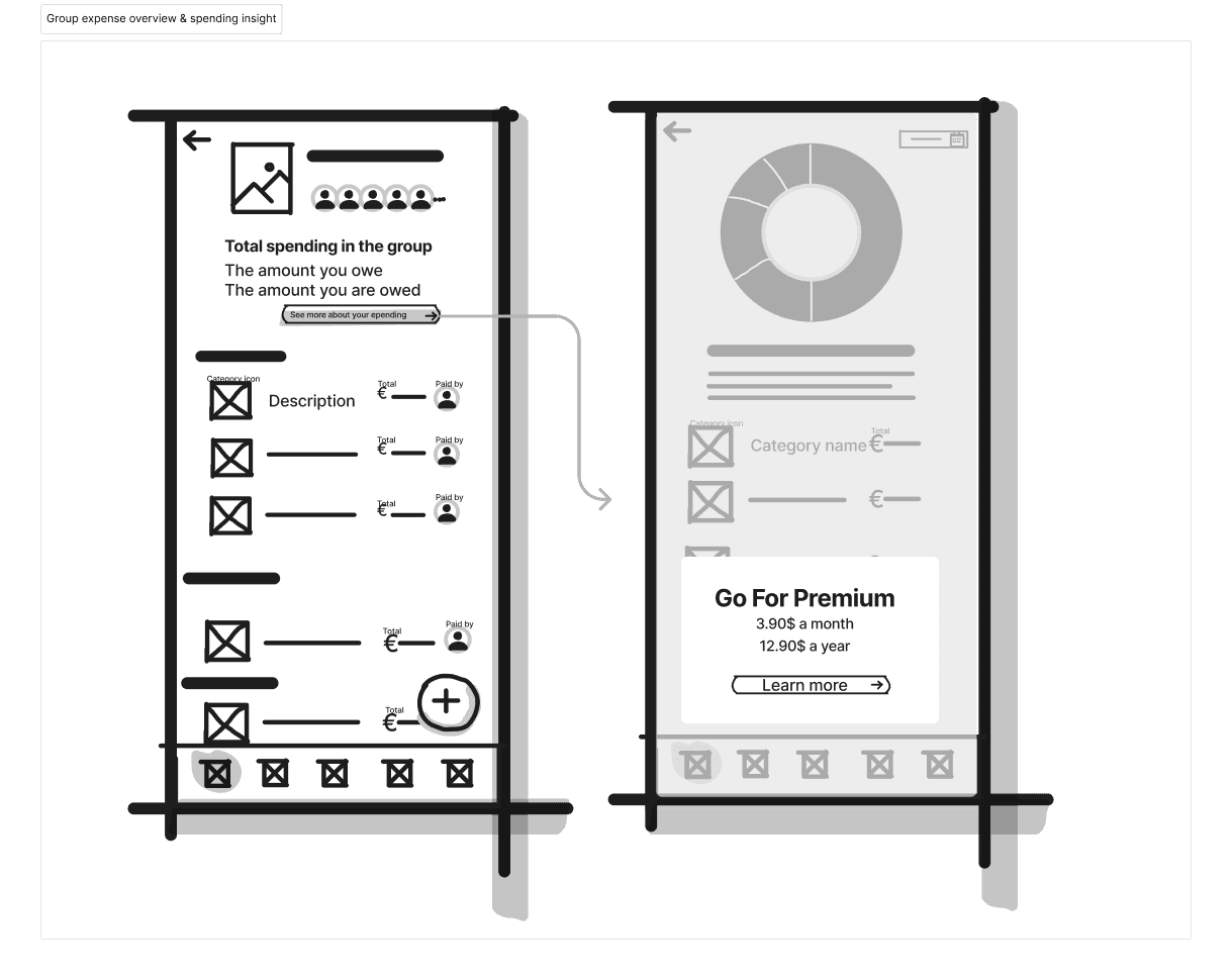
Unclear tracking
Show what they could do
Get rid of unnecessary features
Improve the interface with clearer design so that users can easily see who paid what
A blurred sneak peak of spending insight feature from Pro
High fidelity design and Prototyping
After creating the wireframes, we moved on to developing high-fidelity screens in order to enhance the user interface. Following that, we proceeded with prototyping to prepare for a usability test in the next phase.
The entire prototype can be viewed here.
Simplified flow
Enhanced category experience
Show what they could do
Unclear tracking
Show what they could do
Usability testing

After finishing the prototypes, we organized a usability test using Useberry. To do this, I tested out three different tools in their free versions: Maze, UsabilityHub, and UseBerry. Ultimately, Useberry proved to be the most suitable option for this specific case study.
Results
Simplified flow
Positive feedback on the flow to split an expense unequally
We received positive feedback on the improved flow for dividing expense unevenly.
A room for improvements on the main action button
Unfortunately, we received several comments that it was difficult to find the "Add expense button" which gave negative impression to the entire flow to add expense flow.
Enhanced category experience
Show what they could do
Very positive feedback on new category feasures
Both creating a custom category and adding a category to favourites were well-received and beneficial for users.
Still no interest on upgrading Pros
Even though users mentioned that those category features are very beneficial to them, they didn't find the need of upgrading to Pro.
Next step
Iterate on the design
Our next step is to iterate on the design based on the feedback gathered during the usability test. Especially, we received several comments regarding the floating main action button, so we will plan to review other apps and brainstorm ways to enhance and redesign the main actions buttons. If the time allows, we would prefer to test once again if the new design is indeed better.
Reconsider the upgrade strategy on category features
Regarding categories, we would consider to reduce the number of categories in Free tier. This may encourage users to upgrade to Pro. To test the hypothesis, we could conduct AB testing.
Learnings
UX and UI go hand in hand
During this project, our primary focus was on improving the user experience. However, upon receiving feedback on the main action button, I realized that UX and UI go hand in hand. If we were to start over on this project, we would conduct a thorough study of the user interfaces of other mobile applications. This would allow us to develop better UI designs that offer a more modern and appealing look and feel without compromising its user experience.
Prepare well for users
When gathering insights from users through methods like surveys or usability tests conducted through an app, we learned that it is important to formulate well-crafted questions which clearly convey the context and purpose as we cannot physically be there to do so. Since people have different interpretations, it is crucial to acknowledge our own biases and prepare questions that acquire the desired responses from users. By providing appropriate descriptions and context, we can structure our questions in a way that helps us obtain the insights we need from the users and avoid wasting time of both users and ourselves from doing extra research.